We love our cars in America. So much that over 87 percent of the driving-age population in the United States has driver's licenses.
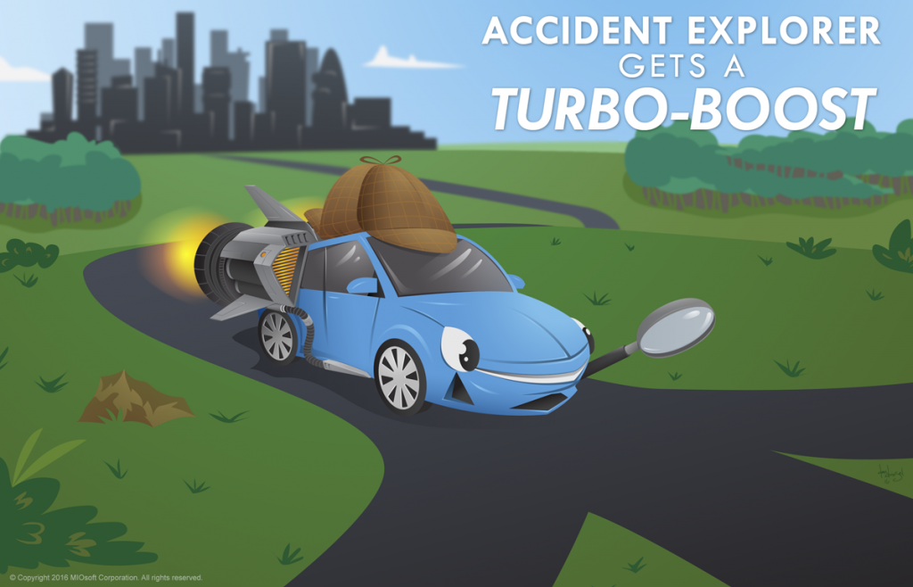
So if you ever drive a car—and odds say you do—you should check out our newly-upgraded Accident Explorer project, which we first wrote about just over a year ago. It now includes the latest dataset from the National Highway Transportation Safety Board, which is for the year 2014.
We’ve also given the interface a makeover and rethought how we display the data. Now, instead of clustering data from all the years together, we cluster data over three-year intervals. As you pick different intervals, you can see how the clusters change—or don’t—over time.
Why do we keep upgrading Accident Explorer? Partly because it’s popular: cars and information about driving are almost universally relevant in the US. Even if you don’t drive yourself, you’re virtually guaranteed to know someone who does.
And partly because Accident Explorer remains an excellent way to show not just what our technology can do, but how the choices you make when you work with data can affect your results.
When you change how you analyze or display data, you can influence the interpretation of the results. Accident Explorer is no different.
We used Accident Explorer’s underlying data to do a quick analysis of fatal accidents and fatal accident clusters for the entire 2008-2014 period using the built-in tools in MIOvantage. Now take a look at our results in the following infographics:
Interesting? Definitely.
If you were to show someone only one of these infographics, you could easily influence how they perceive the safety of driving in any particular state, or how much driving safety varies between states. If you want to impress caution on someone heading for the Great Plains, show them Fatal Vehicle Accidents Per 100,000 Residents; if they’re going to the Southwest, use Fatal Vehicle Accident Clusters Per 100,000 Residents by State instead.
Even the numbers you choose to show, and how you choose to color your map, can help influence the audience. For instance, the numbers for Fatal Vehicle Accident Clusters Per 100,000 Residents by State aren’t that different: despite the dramatic difference in color shading, the range is 0 to 4.4 (and change).
For Fatal Vehicle Accident Clusters by State and Fatal Vehicle Accidents by State, we had to use logarithmic scaling on our raw numbers to make the infographic have an evocative color scheme. Sure, we could have done an infographic without an evocative color scheme, but we have goals here: to showcase our technology, to talk about how displaying data works, to get eyeballs on this post.
We wanted our infographics to display data and support those goals, and using the log of the numbers to get a more compelling color scheme is one way we did it. Whenever you see an infographic anywhere—including here—you should always look at the actual data, not just the visuals, and think about what goals, mindsets, and choices might have influenced how it’s put together.
Over here at MIOsoft, the jury is still out on whether any of those infographics are the best way to relay Accident Explorer’s data on a national scale.
To better dissect what’s happening on America’s roads, we also rethought how we display Accident Explorer itself. In particular, we wanted to address two phenomena:
The latter is especially tricky: roads don’t change that often, but some will, eventually. They get reconfigured, rerouted, expanded. And just as importantly, the infrastructure around them changes: a new office park or big-box store can make a low-traffic road into a high-traffic one almost overnight. Even if the DOT has the resources to respond, it will still probably take years for the road itself to change.
If we just keep adding data from all the years together, the accumulation of accidents will inevitably lead to more and larger clusters. Eventually, clusters will just become a reflection of population density, and the meaning in Accident Explorer will be lost.
To try and combat this, Accident Explorer now looks for clusters over every three-year period in its data: 2008-2010, 2009-2011, 2010-2012, 2011-2013, and 2012-2014.
We think this gives a more interesting view: you can see the clusters that exist now, clusters that have stuck around for a while, and how clusters have changed over time. (Pre-2008 data doesn’t have usable GPS points included, so we’ll have to explore how we can add it.)
Aside from the new time period limitation, we’re using the same approach to clustering that we did before. You can read more about that here, in our original blog post about Accident Explorer.
And, like the previous version, this version of Accident Explorer demonstrates just the start of the unsupervised machine learning clustering, relationship discovery, and data quality capabilities of our MIOvantage data quality software.

 For Data Migration